【識港網訊】當書籍設計師的這些年來,看到很多所謂的語文「規條」,窒礙設計與創意發展,看在眼裡,不吐不快!
常跟編輯爭辯,「空兩格」是「分段」的必要形式嗎?
我認為,「分段」只有一個目的與功能,就是把段與段之間清楚分隔開,使得有停頓位出現,讓作者開展另一話題,也給讀者一剎那的休息時間。對我來說,作為書籍設計師,我完全接受空一格、空兩格、隔行(段間距),甚至其他分段的設計手法;只要清晰、易讀、與column-width比例均稱、合乎該書的設計概念原則即可。版面設計有甚麼是不可以的呢?根本無「一本通書睇到老」!
編輯常以「傳統」兩字來嚇唬設計師,那我們就來談談「分段」的傳統吧。

中國「空兩格」的歷史
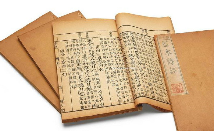
翻查歷史,我們的老祖宗幾千年來運用漢字書寫文章,古文既不分段,也不用標點,整篇由頭到尾「渾然一體」。古書一般不斷句,前人讀書需要自己斷句,所以讀書人要學懂「句讀」的基本功。一句話說畢,或表達了一個完整的意思後的停頓,稱為「句」;一句話沒說完,或說了一個不完整的表述而需要停頓,稱為「讀」;兩者合稱為「句讀」。在標點符號引進到中國之前,分段分句就是靠讀者的「句讀」能力。
因此,在新文化運動之前,中國根本沒有標點符號及分段的概念,兩者皆由西方傳入,這只是近一百年的事。1910年,汪原放受到胡適《論點點符號》的影響,率先以《水滸傳》作試驗,把原文加上西式標點,亦按洋人的習慣劃分段落,交予東亞圖書館出版發行。到1919年,胡適、周作人、錢玄同、劉半農、朱希祖、馬裕藻等北大教授向教育部提出《請頒行新式標點符號議案》,從此改變了傳統的分段格式,在《附則》中規定:「每段開端,必須低兩格。」這就是教條的開始。到1920年2月2日,北京政府教育部正式向各院校頒佈採用《新式標點符號》教育令。
自此,中文的段首空兩格,成為我國中文書寫的所謂「傳統」。追本溯源,這是源於西文的段首縮進的形式(indent),所以,我們不妨看看西文如何編排「indent」。
西方「indent」的多元變化
我曾讀過Richard Hendel所寫的《On Book Design》一書,其中講到「段落」時,他寫道:
What happened between paragraphs? Many designers use an em space to begin a new paragraph. Other designers feel that a space the width of a letter “M” is not enough, and others would use less space, not more. One of the first books I designed was with the artist Leonard Baskin, who insisted on half an em space. A journal editor with whom I worked was uncomfortable with 1 em and wanted 3 ems. We compromised on 2. In Questioning Edmond Jabes, the designer, Richard Eckersley, used what he called “outdents” — hanging indents with the first line of each paragraph flush left and the rest of paragraph indented. Eric Gill’s Essay on Typography has no paragraph indents but instead uses the symbol ¶ (known as a pilcrow). Other designers use no indentations but prefer space between paragraphs.
Jan Tschichold wrote an entire essay on why paragraphs must be indented: because indention guarantees that no reader will miss the beginning of a paragraph and because it does not compromise the design. Spaces between paragraphs are “flagrant interruptions and at times leave the reader in doubt whenever a new page indeed begins with a new paragraph.” Tschichold also felt that a lack of indention compromised the text.
Flush-left paragraph beginnings give the reader the impression that everything on the page is connected…that he is reading a single paragraph. Yet a good writer chooses his paragraph breaks with great forethought and wants them to be recognized as such… While blunt beginnings seems to create a uniform and consistent impression when compared with normal typesetting, this impression is paid for with serious loss of comprehension.
我逐點說明上述三段的大意:
01_ 很多設計師會用一個「em space」作indent(段首縮進),顧名思義,是一個大階「M」的闊度空位。
02_ 有些設計師認為「em space」不夠闊,或太闊,會因應自己的喜好,加多或縮短空位。
03_ 該書作者有一位合作過的藝術家,曾於某本書內堅持要半個「em space」位作indent。
04_ 一位雜誌編輯覺得一個「em space」不夠闊,要求三個,最後大家各讓一步,用兩個em。
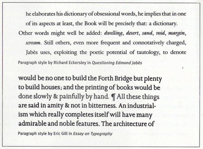
05_ 設計師Richard Eckersley曾在一本書上用上「outdents」,就是段首突出,其餘的段落縮入。(如上圖)
06_ Eric Gill曾經用符號(¶ Pilcrow)代替indent,作分段之用。(如上圖)(其實中世紀未有分段之前,英文段落分隔也是用「¶」符號。)
07_ 其他不用indent的設計師,則以隔行取代。
08_ 知名書籍設計師Jan Tschichold(曾是英國企鵝出版的設計總監)曾寫過一篇文章,解釋為何段首一定要indent,而不能用段首頂格與隔行。他認為,這一看似使文章整齊的開端方式,影響了讀者對內容的理解與閱讀。分段隔行是干擾,讓讀者疑惑新一段的開始,也讓讀者誤會上下文不分。他指出,優秀的作家對於換段有極大的遠見,不能埋沒了作者的用心。因此,明顯的indent能保證讀者不會錯過任何一段的開始。

因此,如果要學西方的「indent」就要學全套,不要只學「龜縮」,而不學他們設計段首形式的靈活與多變。我不是反對indent,只覺得不一定是兩格,也沒有證據顯示「兩格」最好看,那空間要看跟column-width的比例吧。日本與台灣不少書籍和雜誌都只空一格,難道我們就可以一錘定音地說他們的格式是錯的嗎?不可能吧!
漢字文化演化了數千年之久,文字的書寫進程與排版的形式發展是何其豐富多變,我們又何必拘泥於窒礙創意發展的規條呢?
原文鏈接:http://www.orangenews.hk/culture/system/2019/03/21/010112677.shtml